GPSA
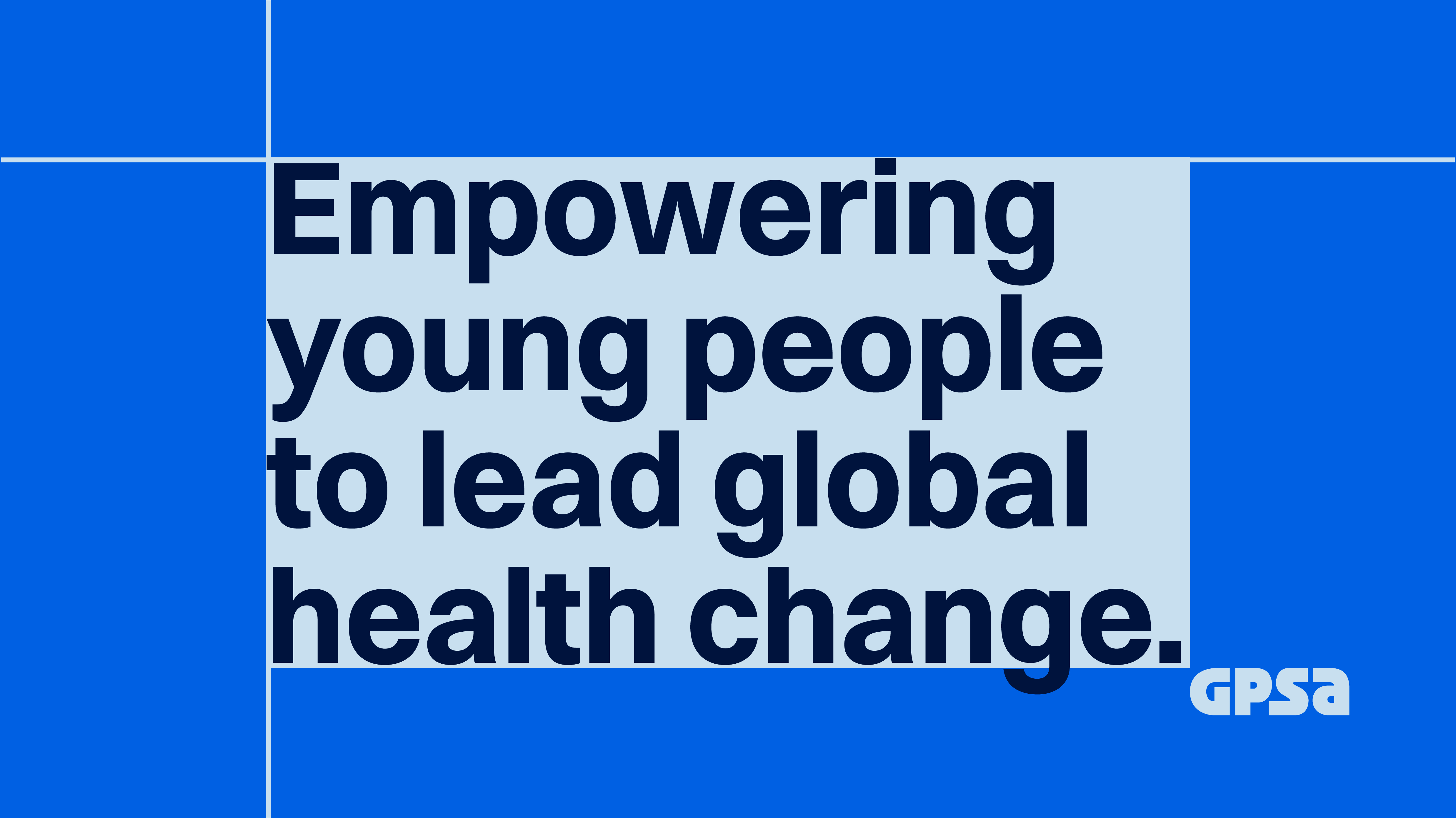
Making a health educational travel experience go bold
Client
Global Public Service Academies (GPSA)
Industry
Civic & Social Organisations
Discipline
Brand Identity
Year
2026
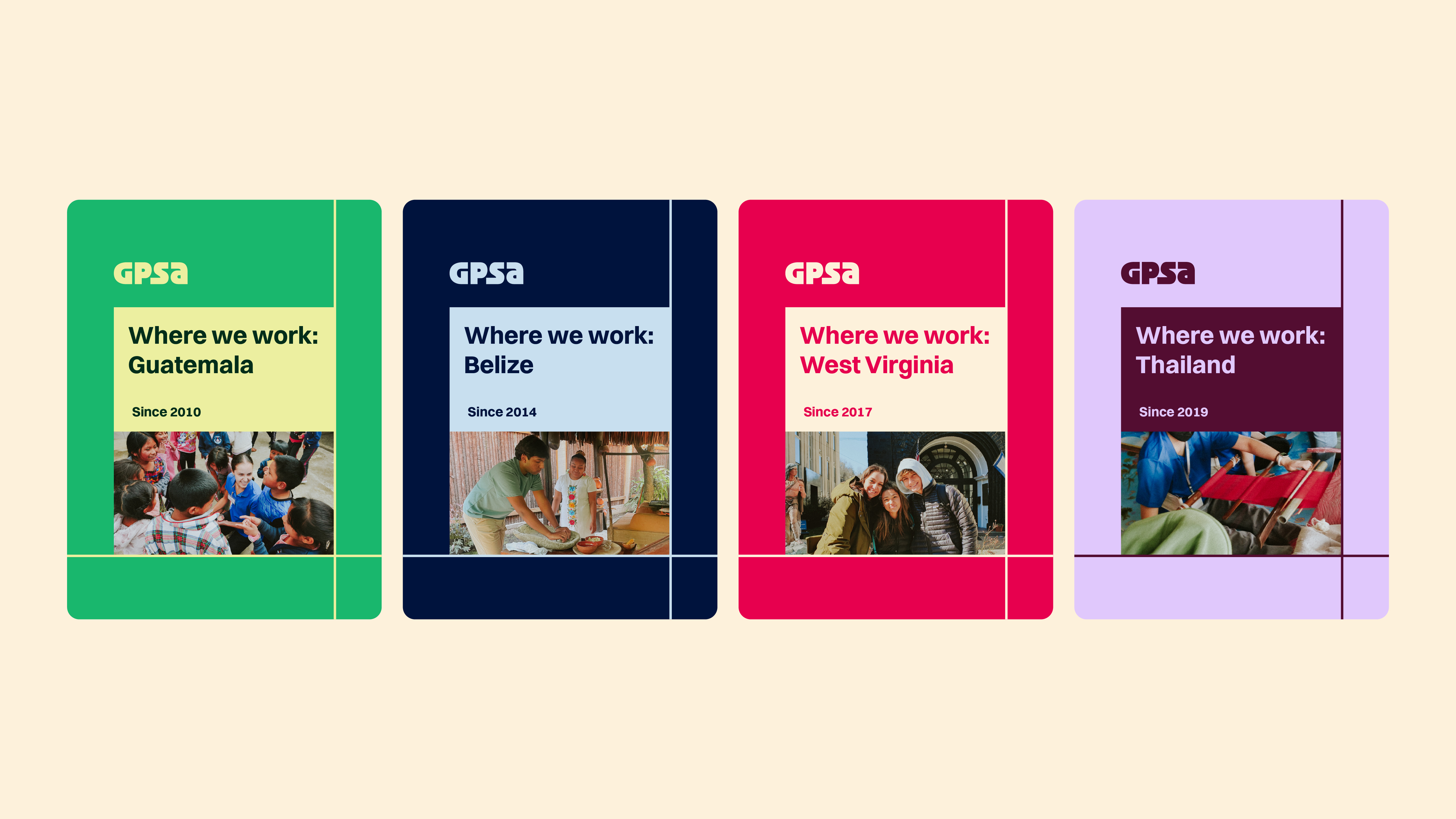
GPSA has been running hands-on health education programmes for high school students across Guatemala, Belize, West Virginia, and Thailand since 2010. After 16 years, their identity no longer reflected the boldness of what they actually do. The brief had three goals: more visibility on search, visual coherence across channels, and a stronger connection with their audience of high school students and staff.
I started with a competitor audit, and the finding was consistent: the category is visually generic, dominated by blues and greens, with forgettable wordmarks and inconsistent photography. The opportunity was clear that GPSA could stand apart without much effort if the direction was intentional.
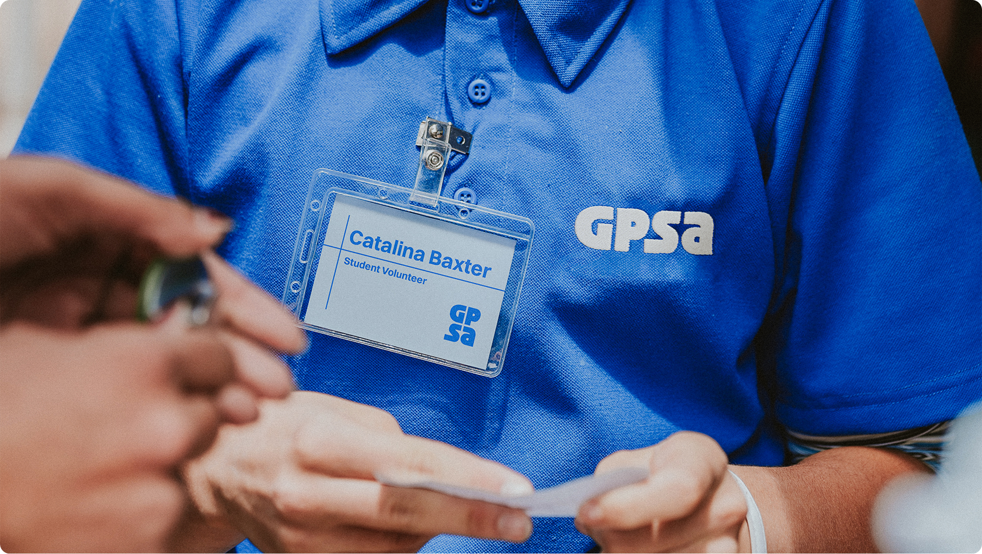
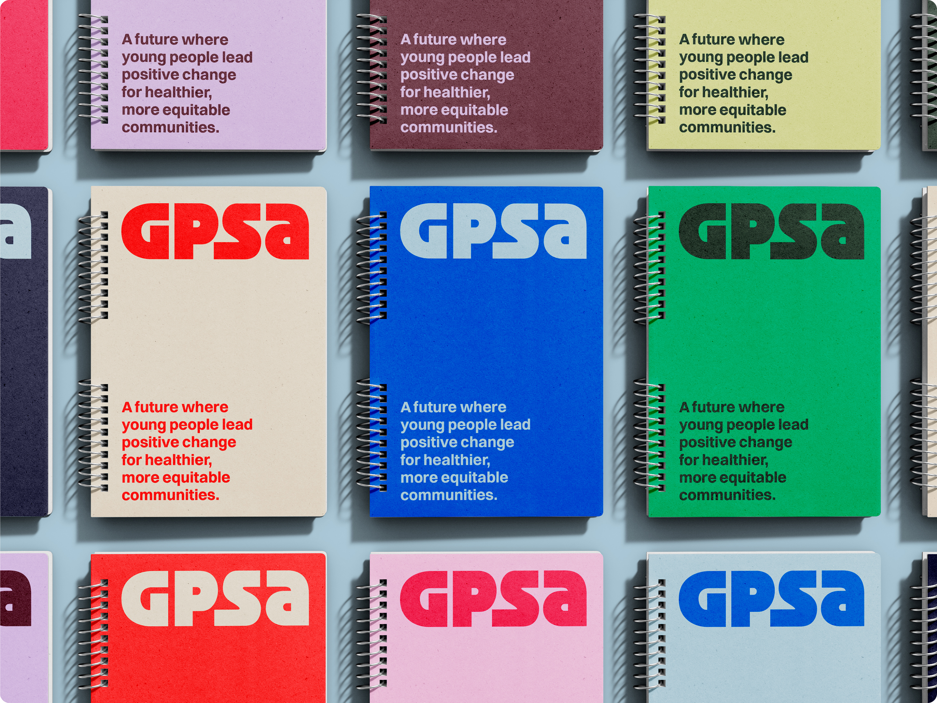
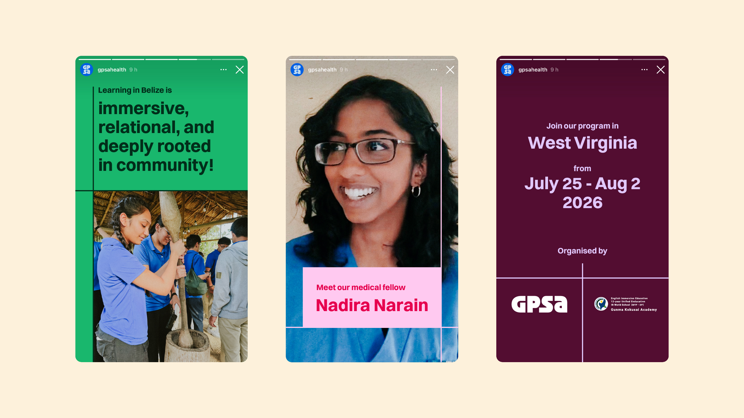
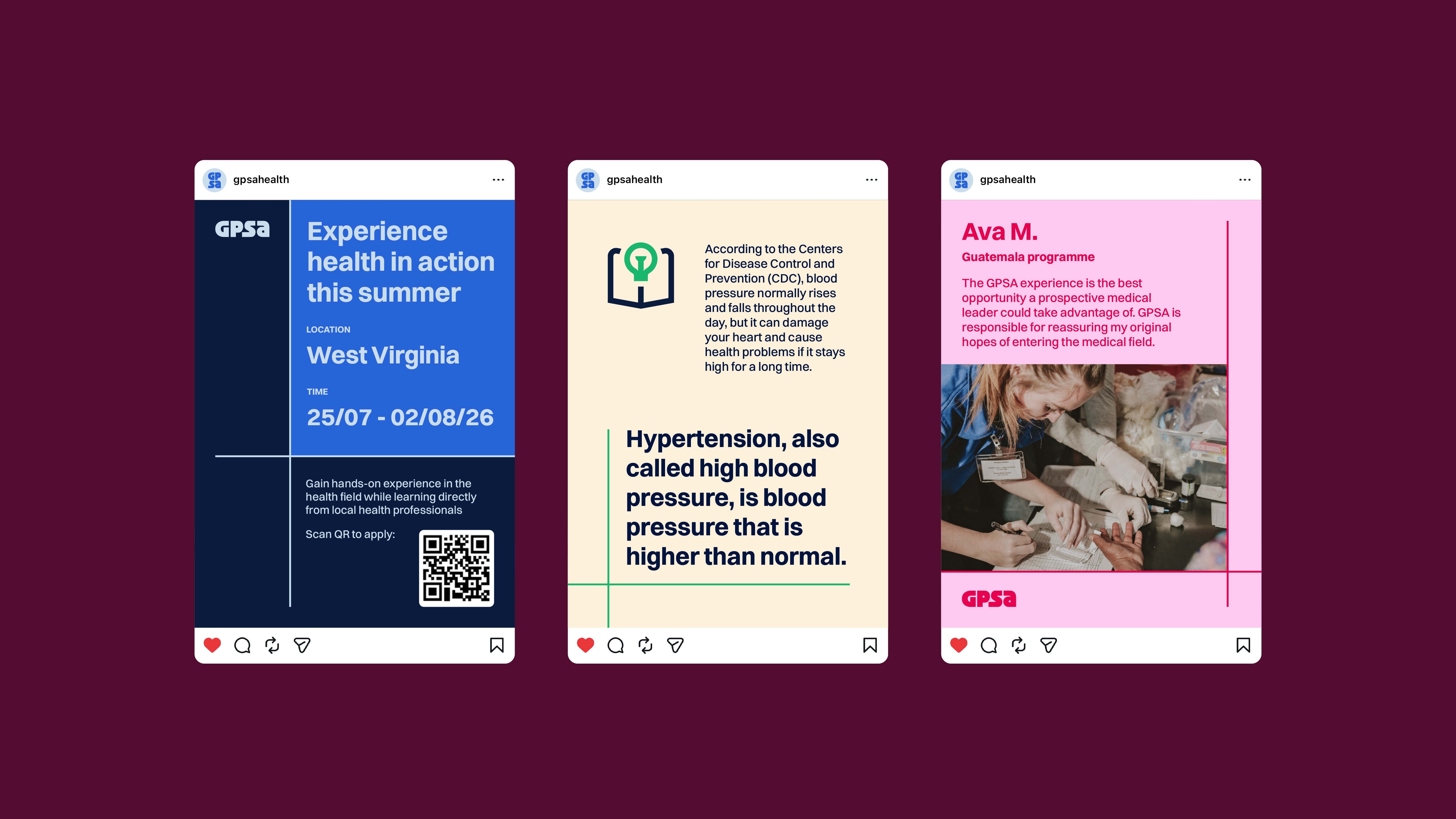
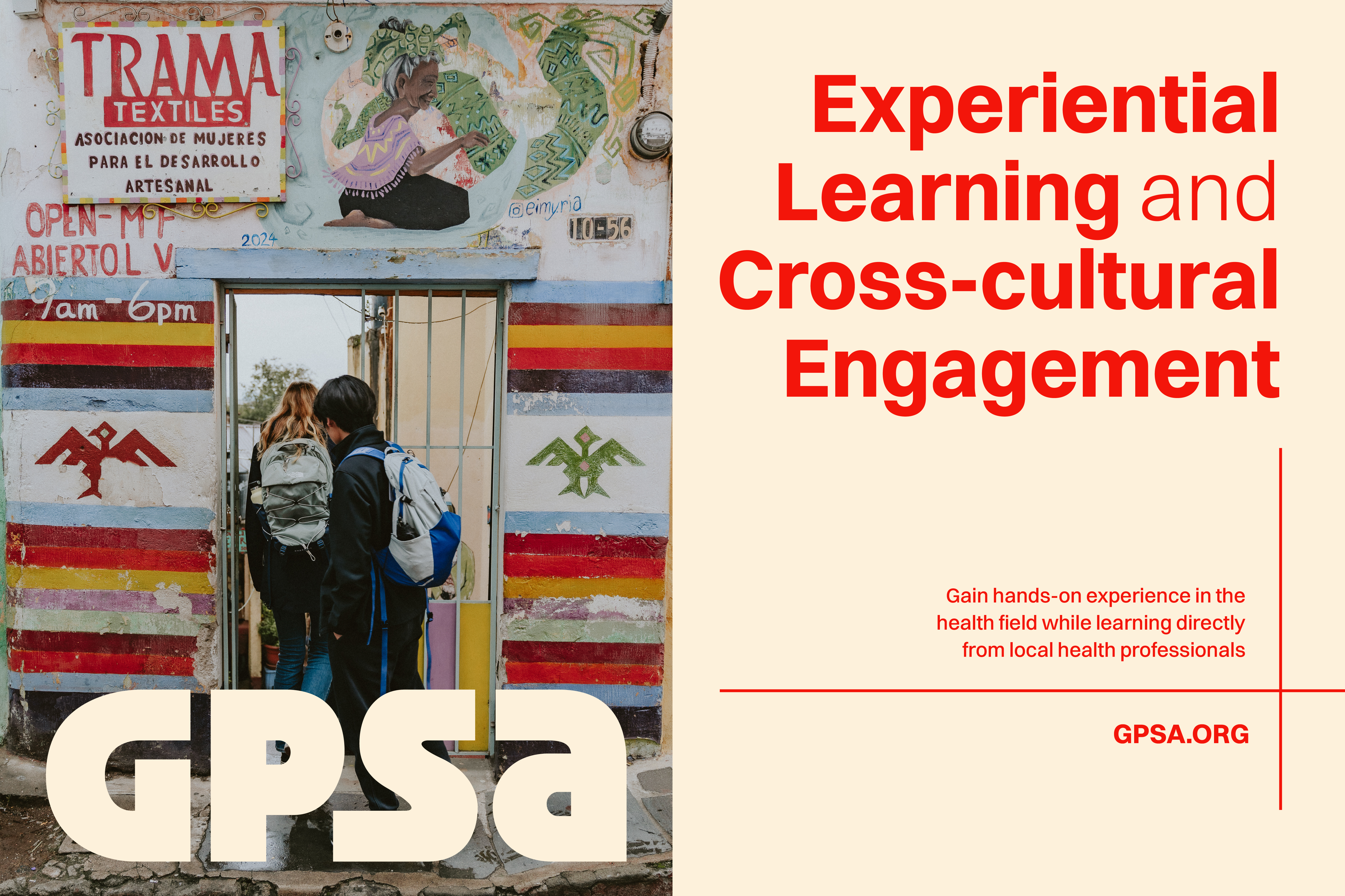
From there, I developed an assessment word map with the client around their brand values, then translated that into two distinct art directions to align on before any design work began. The chosen direction was a bold one, with high-contrast, oversized type, energetic imagery, and keywords that are adventurous, confident, quirky, and unfiltered. Strong photography is needed to carry the art style, which is genuinely different from every competitor in the space.
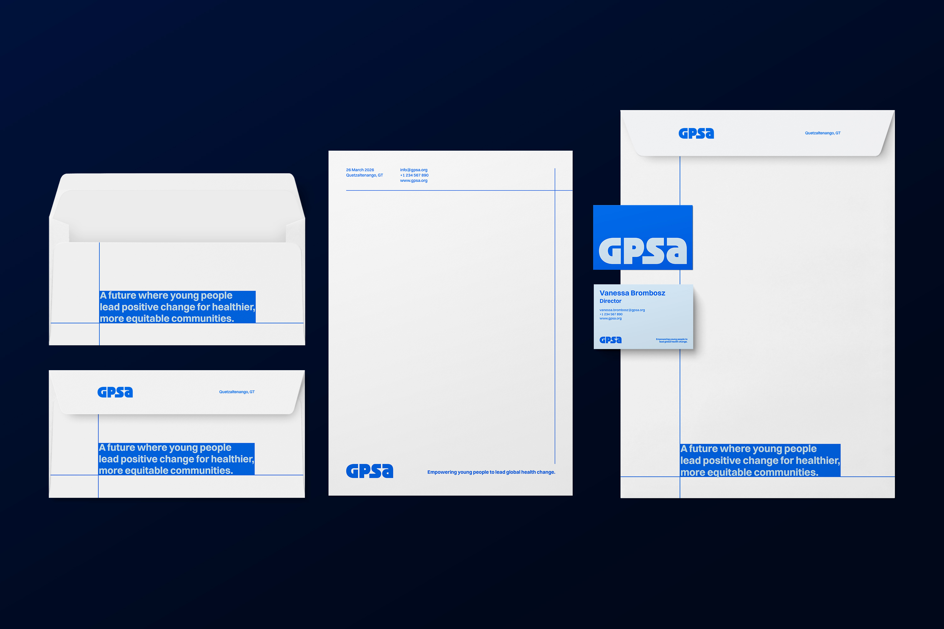
I then built the identity around a visual metaphor that could carry the system: the coordinate system of latitude and longitude lines as a representation of movement across four countries and cultures. These imaginary horizontal and vertical lines in geography serve as a universal address system, providing a set of coordinates that can direct you to any location on Earth. A simpler way to refer to this inspiration is the x-axis and y-axis. Any point that moves around these axes would have its unique x and y values.
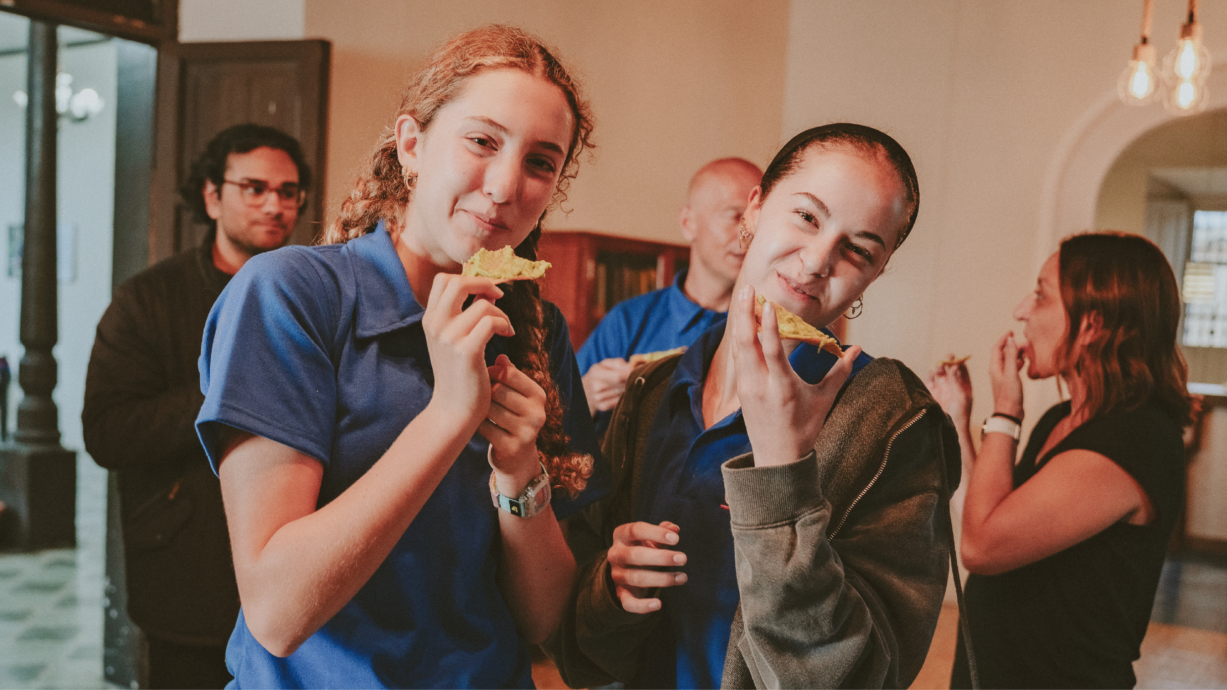
This became the structural logic behind the logotype, the graphic devices, and the layout system. Switzer was chosen as the typeface for its variable weight range, allowing the identity to flex between formal and high-impact contexts. The colour palette was built to do the same. Lifestyle photography is suitable for capturing caring actions, active support, and new experiences that GPSA brings to their volunteers and local communities. The client described the result as fresh and bold, a clear departure from what they had before.